When you’re starting to design a project, whether it’s a poster for a concert or a business card, it can be overwhelming and frustrating. There are so many things to consider, including color, the layout, graphics, words and phrases, and the font. You can have an idea for the color theme and the layout, but when you stick in the font you want, it somehow throws off the whole look and feel. Because the art of design takes years of practice and knowledge, we’re going to focus in on one of these aspects — font.
How to Choose the Right Font
No matter where you are, font is everywhere — on the highway, in the mall, movie posters, on your cereal box, and on the clothes you wear. Font is an incredibly important factor when creating a design, regardless of what the project is — it has the power to change how you feel about something, it can grab your attention, and it can tell your eyes where to go on a page. But the question isn’t about font being important or not, it’s how do you choose the right one?
At House of Printing, the staff at our print shop are experts in design and in the printing industry. We love taking your creations and turning them into a reality. With traditional printing methods or with unique applications like gold foil stamping and spot gloss, House of Printing has what you need to turn your ideas into works of art.
Tips For Choosing the Right Font
Consider the Purpose
Whether you’re designing a concert poster, brochure, restaurant menu, business flyer, logo, a board game, product label, coaster, t-shirt, wedding invitation, or a greeting card, the first thing you should consider the overall purpose of the project. When you have a clear idea of the purpose, then you can start considering what message or emotion you want to convey. If you’re creating a business logo for a bank, for example, you don’t want to use a font that signifies anything other than stability, trust, and security. On the other hand, if you’re creating a logo for a bowling alley, you don’t want a font that is too stuffy or rigid, but something that shows the viewer how much fun they will have.
Grouping Fonts
There are around 300,000 different fonts in the world. Before you start scrolling through the list to try to find the right one, analyzing each curve and trying to determine what message they will convey in your project, there’s a better way to find a font. Rather than looking at each font individually, designers break them down into groups, or families or fonts. Here are some basic groups of fonts that you can look at to narrow down your search. Still confused? Contact our print shop for advice and guidance.
- Geometric Sans: This group actually combines a few similar families of fonts: Geometric, Realist, and Grotesk. As the name suggests, these fonts are based on geometric forms, with straight lines that have a similar weight and consistency. These fonts create a clear message, but can also give a feeling of being cold or impersonal, or even boring. Examples of geometric sans fonts include Helvetica, Franklin Gothic, and Futura.
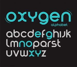
- Humanist Sans: Unlike Geometric Sans, Humanist Sans fonts are more fluid and natural, and are based on our own handwriting. Letters in a Humanist Sans font have more detail, aren’t as consistent, and the weight of each letter can vary. This font gives off a combination of being modern, but be careful with using it in a corporate project, where it may seem insincere. Examples include Myria, Optima, and Verdana.
- Old Style: Also known as Venetian, these fonts are based on centuries-old calligraphy. The weight of the letters with this font will vary, but are consistent from letter to letter. Letters with a curve, like Y or J will tilt slightly to the left. These fonts are classic and traditional, but sometimes classic and traditional can be boring. Examples of Old Style fonts include Jenson, Bembo, and Garamond.
- Transitional and Modern: Transitional fonts began in the mid 18th century, and Modern fonts began in the late 18th century. Designers of the time started to experiment with different styles, adding in geometric lines and sharp details. Baskerville is a great example of Transitional fonts with the details, another is the classic Times New Roman. Modern fonts have both thick and thin lines, giving off a stylish look. Examples of Modern fonts are Bodoni and Didot.
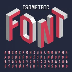
- Slab Serifs: These fonts have simple lines with little contrast, but they have an added bulk with rectangular shapes on the ends of letters. This contrast in personality makes Slab Serif fonts challenging, yet they also fit in many different situations. Examples include Clarendon, Rockwell, Lubalin Graph, and Archer.
Find Contrast
To make a larger impact, many designers choose to use two fonts in one project. This is great when you want to put the focus on the main piece of your design or message, and then use a sub-font to feature the remaining, secondary information. The trick with this strategy, however, is to choose two fonts that create contrast. When choosing two fonts, look for one commonality between the two, but otherwise, they should be completely different. Generally, you should either keep fonts exactly the same, or change it enough to where it’s obvious to the viewer. Look for fonts with similar weight or height or that were created by the same designer.
Another thing to keep in mind when using two fonts for a project is to not go overboard with one of the fonts. If one of the fonds is highly distinct and has a lot of character, you don’t want to overwhelm the viewer by using too much of it. Keep a unique font to a single header.
Throw Out the Rules
Any professional designer understands the importance of following the design rules. And after a few years of practice and really nailing a few projects using the traditional rules, it’s time to branch out and throw the rules in the trash. Design, especially when using font, shouldn’t be nailed down and expected to follow set standards. Rules will first help you understand the basics, and then you can let loose a little bit.
Find a Quality Print Shop
Regardless of your project, whether you choose Helvetica or Verdana, the finished product needs to be professionally printed at a shop that offers superior equipment and service. House of Printing, located in Burtonsville, is a print shop that is dedicated to quality. We have a range of services, from wedding invitations to larger posters, and applications such as gold foil stamping. Everything that we do is with our customer in mind, and our goal is to create finished print products that are crisp, clean, and vibrant.
Contact us today, or if you’re ready to get started, you can upload your files here.