How-to-Design-an-Effective-Brochure-Part-II-5c7023147bf97-1200x563.jpg

How to Design an Effective Brochure – Part II

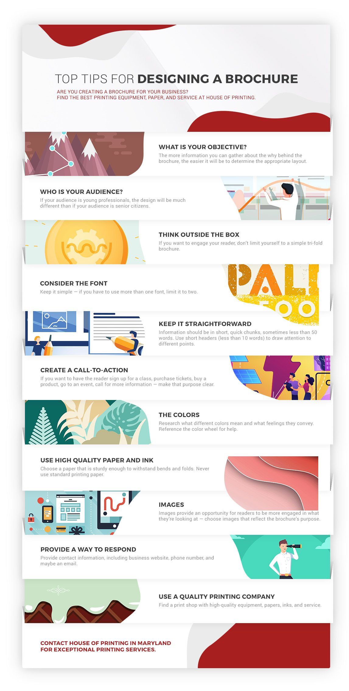
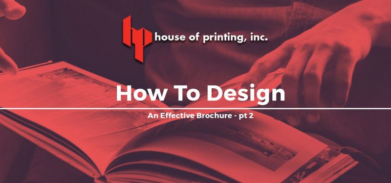
In our last post, we discussed how to design a brochure that makes it easy for readers to quickly understand the given message, whether that’s through the chosen font, how the words are arranged on the paper, or having a clear understanding of who your audience is and what their needs are.

In today’s blog, we’re going to talk about a few more methods on designing a brochure that is engaging, informative, easy to read, and most importantly, high-quality.

If you’re in need of professional printing services in Maryland, get in touch with House of Printing today. Our printing shop offers a range of printing services, including gold foil printing, business card printing, and more, all printed with professional-grade equipment and paper that ensures a beautiful finished product.

Top-Tips-For-Designing-a-Brochure-5c7ec543bafe2.jpg

More on Designing an Engaging, Beautiful Brochure

The Colors

After spending a few minutes searching the Internet, you can find various resources on what different colors mean. For example, you may already know that blue is a calming color, but did you know that it also conveys feelings of trust, tranquility, confidence, loyalty, and integrity? Blue also suppresses the appetite. So if you own a law firm, blue might be a good choice, but on the other hand, if you own a restaurant, it’s probably best to stay away from blue tones. There’s also something to be said about sticking with the classic black and white look, just make sure that the contrast is there. If you need help choosing colors, remember that the color wheel is your best friend — and don’t hesitate to call the team at House of Printing if you have questions.

House-of-Printing-CTA-5bfc04d8449ca.jpg

Use High-Quality Paper and Ink

Designing a brochure isn’t all about what’s on the paper, but also about the actual paper, the design is printed on. The last thing you want after spending days designing a brochure is to print it on standard printer paper. Choose a paper that is sturdy enough to withstand bends and folds. The choice of paper is a direct reflection on your brand and business, so this is one area that shouldn’t be skimped on.

brochure-5c6b45bc42280.jpeg

Images

Graphic design is a beautiful balance between the arrangement of the words, the font, and images. It’s rare that you open up a brochure that only has text in it. Images provide an opportunity for readers to be more engaged in what they’re looking at. Rather than being slowed down with just text, images allow the reader to look from one panel to the next, they can see the product, and the people, or whatever image you choose. Remember that a picture is worth a thousand words — just be sure to choose the right image.

Provide a Way to Respond

Brochures are, after all, a marketing tool, meant to collect information, or to provide information that will entice the reader to follow up (refer to our last post for information on call to actions). At the very least, provide contact information, including business website, phone number, and maybe an email. If possible, create a section that can be filled in and easily removed so the user can leave their information. Get in touch with our printing shop for information on removable brochure panels.

Use a Quality Printing Company

Just like how you want to use a high-quality paper for the brochure, you’ll also want to find a high-quality printing company. With the right equipment, the right ink, paper, set up tools, finishing tools, and more, you can be confident that the brochure will look its best not just because of the design, but because of the printing job.

House of Printing provides quality printing services in Burtonsville, Maryland, and also services the Washington and Baltimore area. If you have any questions about designing a brochure, please give us a call! We’re more than happy to help in any way we can.