The average business owner or office staff may not know the ins and outs of the design and print industry. But for companies that do their own design work and send out informative brochures or calendars to clients and customers, or for employees who need business cards, it’s important to have at least a base knowledge of how these items are designed and printed and the process that’s involved. Having an understanding of this process and the terminology that goes with it will ensure that you’re creating products that are top-notch and professional.
Print Shop Jargon You Should Know
DPI (Dots Per Inch)
This is the number of dots, similar to the pixels on your computer screen, within a square inch of an image. The more dots per inch, the higher quality the image is. Printing companies typically require design to be at least 300 DPI, but again, the higher this resolution is, the better the image. Keep in mind that increasing the DPI will also increase the file size. However, if you are working with an image that is 200 DPI, using software to increase the resolution won’t increase the quality or sharpness of the image.
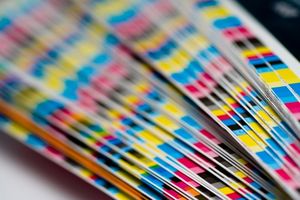
CMYK (Cyan, Magenta, Yellow, Black)
These letters refer to a four-color printing process. Similar to RGB (Red, Green, Blue), but CMYK processing uses percentages of values (100 percent being the max) and gives you a broader range of colors to choose from. This system is widely used across print shops. When creating your artwork, if you have a certain shade of blue for your logo, make sure to use the same CMYK values across pieces.
Pantone Color
Pantone is a company that has been around for decades and they developed a universal system of colors. If you have ever painted a bedroom, you might have a bulk strip of colors, all with their own number value, Pantone 15-0343, for example, is a green color. This system allows you to print the same artwork and have consistent results regardless of the print company you’re working with. The Pantone system also takes the type of paper into consideration. A letter, C, U, or M, will follow each letter, which stand for Coated, Uncoated, or Matte.
RIP (Raster Image Processor)
This is the process of converting an image to a bitmap for printing. When your artwork is flattened, it takes your images and fonts and turns it into a format that is readable by printing equipment. When submitting your artwork, you may be asked to also include link and font tiles.
Bleed
Every piece of artwork, whether it’s a large poster or a brochure, should have a bleed. This is additional space around all of the edges so that any images or text close to the edge won’t be cut off during the printing process. It’s recommended that you use a half inch or more bleed line. If you use software like Adobe InDesign, you can tell it where to place your bleed lines.
These five terms are a great place to start to ensure that your print project is perfect. Even though there are hundreds of other terms, you can leave those to the experts at House of Printing in Burtonsville. Our printing company offers a range of services and we are committed to using the highest-quality paper and inks for a finished project that will ‘wow’ your customers. Get in touch today if you have any questions!